Art styles4 min read
Photo to Sketch Art: Choose What to Keep and What to Simplify
A practical photo-to-sketch workflow covering source selection, line and tone, restrained prompts, and checks for unwanted changes to faces and objects.
In this article
The short answer
For convincing photo-to-sketch art, start with a photograph whose subject reads clearly, decide which details must remain recognizable, and simplify the rest. Choose between a photographic sketch effect and a generative reinterpretation according to how much change you can accept. Inspect structure before judging texture.
Decide what you mean by a sketch
A pencil-like surface, an outline drawing, and a sparse illustration are different outcomes. A sketch effect applied in a conventional photo editor can retain the underlying composition while emphasizing edges or tone. Generative transformation can invent new marks, simplify shapes, and rearrange details. That freedom is useful for expressive art, but it introduces uncertainty.
Write down three things to preserve before you begin: perhaps the tilt of a head, the gap between two people, and the shape of a doorway. Treat these as your review criteria. An attractive texture should not distract you from a changed expression or missing object.
Choose a source with readable shapes
Temporarily previewing a photo in grayscale can reveal whether color is doing all the work. Adobe's black-and-white photography guide discusses how color becomes tone; use that as a diagnostic, then return to your original file for the transformation.
- Use the original photo when available. Avoid a screenshot with interface elements or text over the image.
- Check the main subject at thumbnail size. If it disappears into a crowded background, try a different frame or a modest crop.
- Look for separation between light and dark areas. Hair, clothing, and the background should not all merge into the same dark patch.
- Keep important features inside the frame. A generator cannot reliably recover the real shape of a hand or face hidden in the source.
Match the treatment to the photograph
These are starting experiments, not rules. Avoid asking for every texture at once. Pencil, charcoal, watercolor, engraving, and ink can pull the same image in competing directions. Choose one main mark and one supporting quality, such as light shading or spacious composition.
| Source photograph | Treatment to try | Watch for |
|---|---|---|
| A face with soft side lighting | Gentle tonal shading with few hard edges | Exaggerated wrinkles or a changed expression |
| A building with a strong outline | Sparse line work with selective shadow | Bent windows and altered proportions |
| A landscape with one dominant shape | Simplified illustration with open paper space | Invented landmarks or an overcrowded background |
Try expressive simplification with a short direction
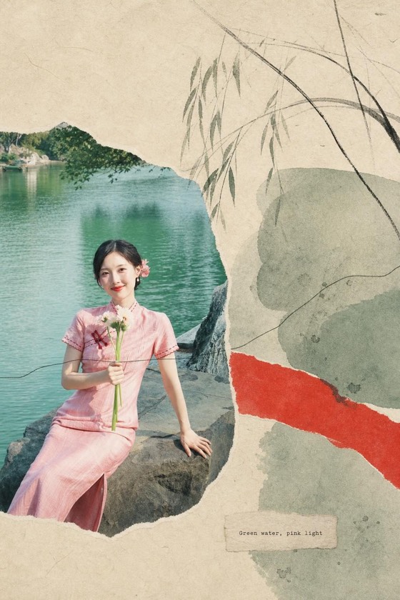
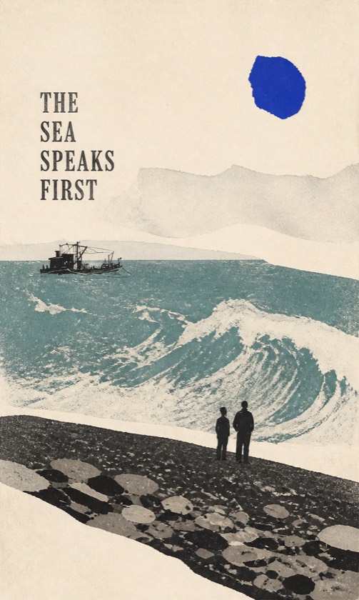
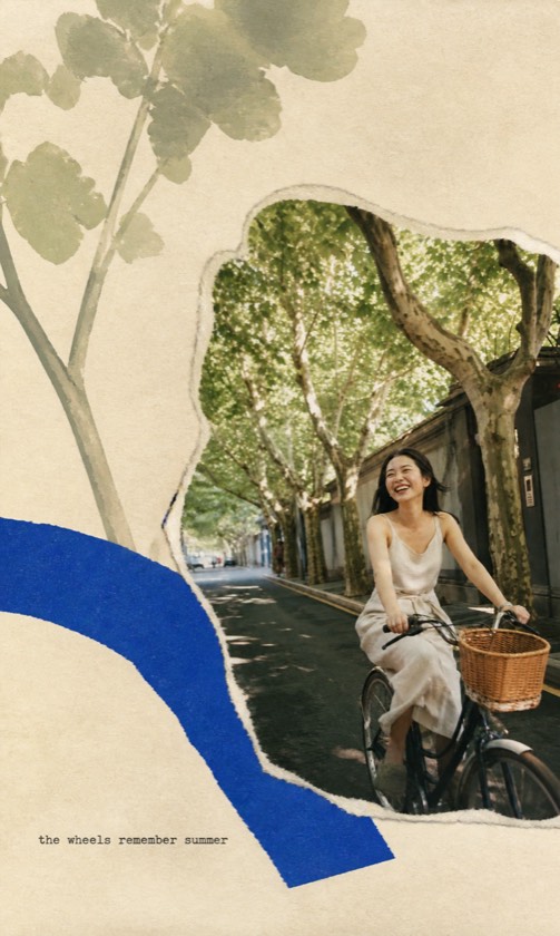
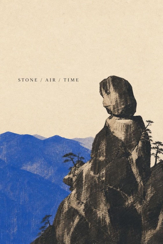
ZineSketch is our photo-art tool. Its Image Distillation direction turns a photo toward illustration, a clear subject, and a restrained visual metaphor. It is an expressive option, not a promise of an exact pencil tracing. Compare the published examples before deciding whether that interpretation suits your photograph.
The optional direction field accepts up to 60 characters. Use it to name one priority; do not paste a long general-purpose image prompt into that field. For example:
A prompt to adapt
Keep the tree shape; simplify the distant background.
Review structure before surface detail
Place the result beside the original. Compare the silhouette first, then the position of major features, then small details. For portraits, look at eye direction, mouth shape, and the relation of the face to the neck. For objects, count visible parts and inspect how they connect.
If the result feels muddy, try a source with clearer tonal separation. If it feels overworked, ask for less background detail. If likeness or geometry keeps drifting, use a conventional editing or drawing workflow where you can directly control the relevant areas. Repeated generation cannot guarantee fidelity.
Judge the finished image at its intended size
A texture that looks appealing when enlarged may become noise on a small card. Conversely, thin lines can disappear when printed. Inspect the downloaded file's actual dimensions and make a test at your chosen size. Keep both the source and the result so you can revisit the treatment without losing the original photograph.
A few more answers
Frequently asked questions
- Can a photo-to-sketch tool preserve a face exactly?
- Generative tools can change facial details. If exact likeness matters, compare carefully with the source and choose a controlled photo-editing or manual drawing process.
- Should I convert the source to black and white first?
- You can preview it that way to assess tone. Keep the color original; it may provide useful information for a colored illustration or another treatment.
- Why do small details look messy?
- Dense backgrounds and tiny features can turn into competing marks. Try a clearer crop, a less cluttered source, or a simpler treatment.
Sources & further reading
A note from the editors
Made by the people behind ZineSketch.
We operate ZineSketch and use AI to help draft and edit these guides. We review the text and linked sources before publication, identify our own gallery examples, and explain where our product fits. These guides are not independent hands-on tests of every service mentioned.
About the ZineSketch Editorial TeamMake something of your own
Give your photos
a place on the page.
Choose an art direction and start with a moment you want to remember.
Explore photo-to-illustration examples