Art styles4 min read
Beautiful Photo Collage Styles: Find a Clear Visual Hierarchy
Choose a photo collage style by deciding what the viewer should notice first, then control paper texture, spacing, color, and decorative detail.
In this article
The short answer
A beautiful photo collage needs a clear order of attention: a main photograph or subject, a small number of supporting shapes, and space around them. Choose the style according to what the photo already contains. Add material and decoration only when they strengthen the story or make the composition easier to read.
Start with the thing the viewer should notice first
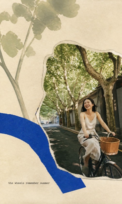
Before choosing paper textures, finish this sentence: 'This page is about…' A person cycling home and a crowded family meal need different arrangements. Find the visual evidence for your answer in the photograph. Give that area the strongest contrast, clearest edge, or most generous space.
A busy photograph may need only a restrained surround. A simple subject against an open background can accommodate stronger paper shapes. Let decoration respond to the image.
Compare four useful collage approaches
Establish a dominant approach before mixing treatments. Equal-sized panels, heavy torn edges, large lettering, and dense illustration can create too many competing focal points.
| Approach | Useful starting material | A constraint to try |
|---|---|---|
| Photo-led paper collage | A memorable scene with readable people or objects | Keep one photographic anchor; repeat one source color |
| Quiet editorial page | A single strong subject or spacious landscape | Use a generous margin and one small secondary element |
| Sequential journal page | An everyday moment with useful details | Give one frame more space than the supporting frames |
| Illustrated interpretation | A photo with a strong silhouette or emotional idea | Choose one visual metaphor and remove unrelated decoration |
Build a restrained palette from the source
Try a subtraction exercise: remove half the decoration. Add one element back only if you can explain its contribution. This makes choices about tape, scribbles, borders, and captions more concrete.
- Pick one color already present in the photograph: a jacket, a wall, water, or foliage.
- Choose a neutral paper tone that keeps the subject readable. Warm paper is not automatically better for every photo.
- Repeat the source color in a small supporting shape or mark. Leave other accents quiet.
- Zoom out. If the paper treatment draws attention before the subject, reduce its contrast or visual weight.
Use published examples to choose a direction
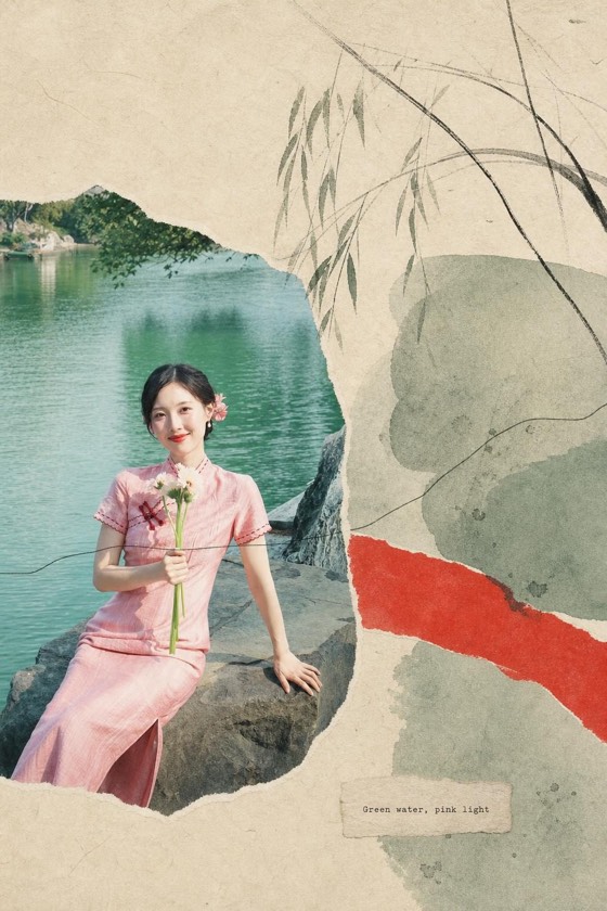
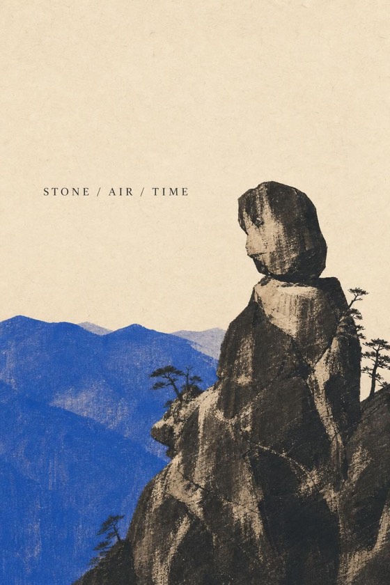
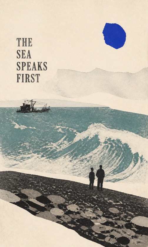
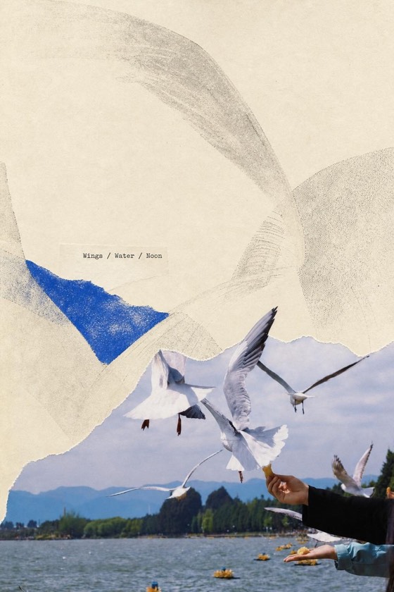
ZineSketch is our photo-art tool. Scenes Gathered combines a photographic anchor with paper collage and illustration derived from the source. Japanese Journal emphasizes sequential framing and pencil details. Image Distillation moves further toward illustration and a restrained metaphor. Compare those differences before choosing a style for your own photo.
The gallery images here are published style examples, not demonstrations produced by the instruction below. In ZineSketch's optional direction field, keep your request within 60 characters and name one compositional priority:
A prompt to adapt
One photo anchor, pale paper, a single green accent.
Correct the most common collage problems
Generative art can alter faces and scene details even when the direction asks to retain them. Review the result against the original. If you need to move an element precisely or preserve every photographic pixel, finish in a manual collage editor with separate layers.
- Everything has equal weight: enlarge the main subject or reduce competing decoration in a layout editor.
- The photo looks pasted on without connection: repeat a color, curve, or texture already present in the scene.
- The page feels cramped: simplify the source crop or request more open space, then inspect the new result.
- The decoration changes the story: remove invented words, objects, or symbols that suggest something that did not happen.
Make a set feel related without repeating the layout
For several pages, carry over two choices, such as paper tone and accent color, while allowing the subject scale to change. Check the pages together at thumbnail size. A shared style is a starting point; you remain the editor who decides which results belong in the same set.
A few more answers
Frequently asked questions
- How many photos should a collage contain?
- One photo can be enough when paper and illustration provide the supporting elements. If you combine several photos manually, give one a clear lead.
- Can I rearrange generated collage elements in ZineSketch?
- ZineSketch generates finished image pages rather than an editable design document. Use a separate layout editor when you need direct control over individual elements.
- What makes a collage feel personal?
- Use details from the actual scene: its colors, objects, shapes, or a specific memory. Generic stickers and slogans often contribute less than one meaningful detail.
Sources & further reading
A note from the editors
Made by the people behind ZineSketch.
We operate ZineSketch and use AI to help draft and edit these guides. We review the text and linked sources before publication, identify our own gallery examples, and explain where our product fits. These guides are not independent hands-on tests of every service mentioned.
About the ZineSketch Editorial TeamMake something of your own
Give your photos
a place on the page.
Choose an art direction and start with a moment you want to remember.
Explore photo collage examples